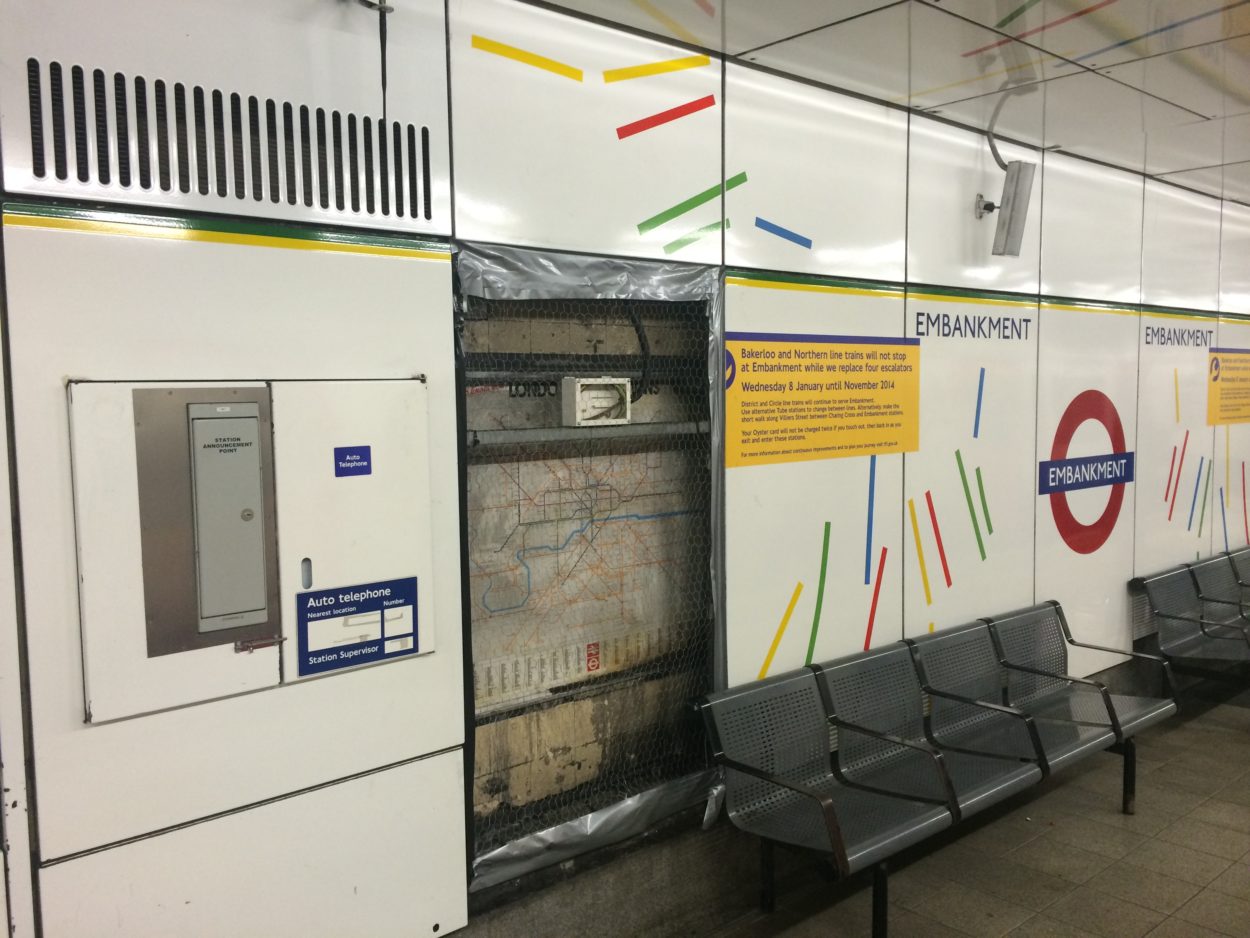
AN OLD London Underground map has recently been uncovered on the District line platforms at Embankment station. It’s gained a bit of a cult following over the last couple of weeks, including coverage from Time Out’s Now. Here. This. and the Station Master blog.
Mapping the Tube: 1 – Embankment
-
- 7 minute read
- 8 Comments

AN OLD London Underground map has recently been uncovered on the District line platforms at Embankment station. It’s gained a bit of a cult following over the last couple of weeks, including coverage from Time Out’s Now. Here. This. and the Station Master blog.
But just how old is old? The map – which is actually an early edition of the ‘London Connections’ map – contains a number of useful clues allowing a startlingly accurate date to be estimated – long-closed stations and lines, under-construction spurs and the non-existence of numerous present-day lines, including the entirety of the London Overground and Docklands Light Railway and the Jubilee Line Extension (JLE).

As many readers are no doubt aware, Embankment station is currently undergoing major escalator renewal works, which has seen the Bakerloo and Northern lines non-stopping the station since December of last year. Various other upgrade works are being carried out at the station during engineering hours, including the removal of enamel panelling along the District line platforms which has revealed the map in question.
The panelling itself, made by German company Boos & Hahn, was installed on the platforms at Embankment during the 1980s, immediately providing a hint as to the map’s age. Although not as old as the Temple map (Which I will be covering in a future edition of this occasional series), this new find at Embankment is still an intriguing look back at a particularly interesting period in the history of London’s transport systems.

Both Aldywch and the Epping-Ongar branch line are still shown on the map, so even if it had been placed there since the platforms were re-panelled it can date from no later than September 30 1994, when both of these little-used relics closed. Additionally, the West London Line service to Kensington Olympia is shown as ‘limited service’ – a full service was not re-instated until 1994 under British Rail (BR)’s Network SouthEast operation.
However, as we’ve already established that the map has to date from the previous decade, we can also quickly rule out the other changes that remained on London’s transport maps until the 1990s: both the Hammersmith & City and former East London lines are still coloured in Metropolitan maroon – not gaining their own identity until 1990 – whilst the national rail services are coloured orange. Additionally, Primrose Hill and Westbourne Park are still present on the map as BR stations – closing in 1992.

So – we know that the map cannot have been produced more recently than 1990 – but what about at the other end of the spectrum? By far the biggest change to give the map a firm lower buffer is that the Jubilee line is running to Charing Cross: the new line (An extension of the former Bakerloo line branch to Stanmore) opened to much fanfare in May 1979, which also saw a large renaming exercise take place at surrounding stations. What is now Charing Cross was originally two separate stations (the Bakerloo line’s Trafalgar Square and the Northern line’s Strand), whilst the present-day Embankment was originally known as Charing Cross. This all changed when the Jubilee line opened, the new platforms bridging the gap between the two stations and providing the present day configuration. Confused? Don’t worry – I’ll be coming back to this anachronism at a future date.
We can do better still, though, and root our map firmly in the 1980s. Returning to the Epping-Ongar branch line, we can again use this to date our map, but this time as no earlier than 1981 due to the non-appearance of the intermediate Blake Hall station. This quiet halt was one of the least used on the entire London Underground network, and closed for good at the end of traffic on 31 October 1981. Blake Hall’s platform was demolished soon after closure, although the station building remains as a private dwelling, with the line now being part of the preserved Epping-Ongar Railway.
The 1980s was a very busy time for changes to London’s transport network, with major changes occurring pretty much every year. The tube network itself suffered from a chronic lack of funding with stations and rolling stock starting to look increasingly tired. Conversely, though, BR services were experiencing a small boom – in Central London, at least. The ambitious Thameslink project – started in the late 1970s with the aim of creating a new, electrified cross-London rail link – was well on the way to completion, re-using the closed Snow Hill tunnel and linking together the Midland and Brighton Mainlines, via the City Widened Lines.

Our map firmly comes in about halfway through the project – the line between Moorgate and Bedford, via the City Widened Lines, is clearly shown as an all-day operation, which came into force on July 15 1983. However, the cross-London line itself is not completed – the line to Holborn Viaduct was closed and diverted into the Snow Hill tunnels, with the new City Thameslink station opening in roughly the same place and incorporating several aspects of the original Holborn Viaduct’s façade. Thameslink itself opened in May 1988 – so our map cannot be any later than this.
Things were less rosy to the north-west, however. Bakerloo line services north of Stonebridge Park (to Watford Junction) were suspended after 1982, although a peak-hours only service to Harrow & Wealdstone was restored after 1984, ahead of a full re-opening in 1989. This restricted service is clearly shown on our map at Embankment, placing our map at some time between 1984 and 1988.

One of the most obvious ones that jumped out to me (and nearly everyone else who has seen the map) is in the bottom left-hand corner: the dotted outline of the then-under construction single-track loop line between Heathrow Central (now Terminals 1, 2, 3) and Heathrow Terminal 4. The new branch line opened on April 12 1986.
Nonetheless – I was determined to find an even more specific time period for this map, and kept searching for further changes. In terms of those that would immediately spring to the attention of even the most casual of observers, that’s it – all the big changes (that I can find, at least!) have been listed, not to mention all the ones appertaining to the London Underground itself.
But there are three more changes to London’s transport network that allow us to very firmly root this map into a remarkably small window, and all of them occurred during 1985. The town of Eltham originally boasted two railway stations, Eltham Well Hall and Eltham Park, but these were replaced by a single new Eltham station (Not to be confused with New Eltham station!) on March 17 1985 along with a new section of the A2 Rochester Relief Road. Embankment’s London Connections map depicts this change.

Five months later, on July 8 1985, Lea Bridge station saw its final passenger service, when the line between Tottenham Hale and North Woolwich via Stratford low-level closed to regular passenger traffic. The station, which had been reduced to an unstaffed halt in 1976, consisted of two platforms and a simple, open-sided shelter across the road bridge, replacing the original station buildings which were demolished when the station became unstaffed. This station still appears on the map at Embankment, meaning that it must date from before this time – in other words, in the five month gap between March and July 1985. Interestingly, though, the map is also providing a glimpse of what is to come: services were re-instated between Tottenham Hale and Stratford (starting from Stansted Airport) in December 2005, with the station at Lea Bridge being rebuilt and reopened as part of plans to boost regeneration in the local area. The ‘new’ Lea Bridge station is due to open in December 2015.
By anyone’s standards, narrowing an obscure map hidden away on a London Underground platform down to a five month window is a remarkable achievement – but it’s possible to get even more specific. There is one final change to the map that narrows Embankment’s London Connections map down to a 2 month window. Specifically, a period of 55 days. Yep. Just 8 weeks – May 13 1985 to 8 July 1985.

That change concerns the North London Line, running between Richmond and North Woolwich, via Stratford low-level. Prior to May 13 1985, the North London Line (NLL) operated – wholly electrified by third-rail – between Richmond and Broad Street station, with short workings turning at Caledonian Road and Barnsbury. Additionally, the map shows a peak time-only service continuing through Primrose Hill and in parallel with the “primary” route, rather than merging as would be expected if the terminus was still at Broad Street. The NLL beyond Dalston to North Woolwich was electrified at this time, increasing service levels on the line and changing the service pattern, in turn paving the way for the closure of Broad Street station a year later. The aforementioned service between Tottenham and North Woolwich remained operated by diesel trains until the closure of that branch eight weeks later: the time our map goes out of date.
I surmise that the map would date from sooner rather than alter within this window, as the new services on the NLL would surely have warranted a lot of publicity from BR at the time. It is also quite likely that the map’s design was confirmed before the official closure notice for Lea Bridge station had been confirmed, otherwise it would have been likely that a note would have been made on the map, or its publication deferred by a couple of months to avoid the near-immediate obsolescence.
It is remarkable how much information can be gleaned from a map that is relatively recent in the bigger picture of London’s transport history, and I didn’t expect to narrow it down so specifically when I first set out to get a broad date for the map beyond “the 1980s”.
- Mapping the Tube is an occasional blog series exploring the origins and changes to maps and diagrams of London’s world-famous Underground network. If you know of a rare or interesting map that could be a candidate for a detailed dissection, please get in touch.
My thanks go to Geoff Marshall (@geofftech) and Louise Marston (@MarstonLouise) for allowing me to use their photographs of the Embankment map. All copyright remains with them, and permission must be sought prior to their reuse.